I've got no pictures... my pictures are all inside my sony phone where my gf is still having it...
so... this post imma go simple...
RATE MY SIGS...


From top to bottom...
I'm playing Dragonica recently.. and my username is nebula so that's why i'm using that as my design name... otherwise it would have been HeartRoxas or Roxas Design all the time...
Edit:

Comment and critisize... thanks...
This is HeartRoxas Signing Out~


5 back-fires:
why use korean words ar??
and is nice. finally u got ur idea back. i still don have. so boring la now.
orait here come some noobie com and crit...
the first 1...
for me the vector is abit messy...
maybe because the uneven distribution...
the main object cant be show out nicely...
the background is too 抢镜....
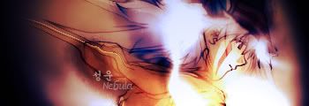
second 1...
personally like this...
the colour tone make eyes feel 舒服...
the background smudge not bad...
third 1...
since is your masterpiece...
i carefully view it for many times...
but after you rework...
kinda weird...
the fire on hand become unknown light...
maybe its too small? just i cant see the detail...
because of the mask also maybe...not sure...
just dun like...
colour dun have tone....i wan see the original 1 leh...
last 1...
kawaii neh...
first i like blue colour...
so i will like this...
not much to comment...
simple but nice...
@tham...
ty... korean words for saja only... design ma... it means 星云 basically.. nebula...
@tommy...
ori one also not nice de la... cause change got la but a bit oni... it WAS my masterpiece... now i'm alot improved... my masterpiece would be pt 03 04 shirt.... that drained habis my design ideas... lol
i like the way u chose color.
im bad at that.
can teach me??
u see my design b4 u know mostly is mono color one.
there's good in mono tones too...
we can call those minimalistic, depends fully on how you plant those brushes and stuff...
you are not a sig maker... i'm one.. so you cant really compare like that... besides... i learn photoshop for more than 2 years now... you're still new...
well if you have a render... always use 2 colours from your render and cloud/brush/gradient it as your background...
Post a Comment